Developers
How to check text contrast for WCAG and fix failing colors
Gray text on white, white labels on a mid-tone button and text over a photo are easy places to miss the contrast requirement. This guide covers the WCAG thresholds, how to measure a pair, and a fix that keeps the same hue.
- HNarzędzia editorial team
- Published:
Text that looks fine on a good monitor can be hard to read on a phone in sunlight, or for someone with low vision. WCAG does not leave that to judgment: the contrast between text and background is calculated and compared with a threshold. Two colors are enough to find out whether a pair passes and, if it fails, how much lighter or darker one of them has to be.
WCAG 2.x thresholds
The values below come from WCAG 2.2 (W3C Recommendation, 12 December 2024) and the W3C explanations of 1.4.3 and 1.4.11. We checked them in October 2026.
| What you are checking | AA | AAA | Criterion |
|---|---|---|---|
| Normal text | 4.5:1 | 7:1 | 1.4.3 (AA), 1.4.6 (AAA) |
| Large text | 3:1 | 4.5:1 | 1.4.3 (AA), 1.4.6 (AAA) |
| UI components and essential parts of graphics, such as a field border, an icon or a focus indicator | 3:1 against adjacent colors | no threshold | 1.4.11 |
The ratio is not rounded. W3C gives an example: 4.499:1 does not meet 4.5:1. The Contrast Checker shows such a result as 4.49:1 so it does not suggest a pass.
The text threshold does not apply to text in inactive UI components, pure decoration, text that nobody can see, or logotypes. Criterion 1.4.11 also skips inactive components. W3C exempts the browser’s default focus style, but a focus indicator you design yourself needs 3:1.
What counts as large text
WCAG defines large text as at least 18 point, or 14 point bold. The W3C page for 1.4.3 converts that to about 24 px and about 18.5 px (at 1 pt = 1.333 px). The same page warns that “18 point” and “bold” can mean different things in different typefaces, and that very thin typefaces are harder to read at low contrast. If your text is borderline, treat it as normal text.
How the ratio is calculated
Contrast is (L1 + 0.05) / (L2 + 0.05), where L1 is the relative luminance of the lighter color and L2 of the darker one. W3C defines luminance as 0.2126·R + 0.7152·G + 0.0722·B computed from the linearized sRGB channels. For #777777, a channel value of 119/255 linearizes to 0.1845, so the ratio against white is (1 + 0.05) / (0.1845 + 0.05) = 4.478:1. You never need to do this by hand, but it explains why two colors that look equally light can have different contrast: green contributes the most to luminance and blue the least.
Where to get the colors
- From code or a design file. The Contrast Checker accepts HEX,
rgb(),hsl()andoklch(). A semi-transparent text color is composited over the background first, and a semi-transparent background over white. - From a screenshot, mockup or photo. Load the image in the Image Color Picker and click a pixel to get its HEX, RGB and HSL values. In Chrome and Edge there is also an eyedropper that picks a color from anywhere on your screen. A color read from a screenshot can differ slightly from the CSS value, for example after JPG compression, so use the value from the code when you have access to it.
- From another notation. The Color Converter converts between HEX, RGB, HSL, HSV, CMYK and OKLCH. It has its own contrast block against a chosen background, but the full AA and AAA table and the suggested fixes are in the Contrast Checker.
Example: several color pairs calculated twice
We typed each pair into the Contrast Checker in Chromium (the Polish and English pages gave the same numbers) and then recalculated it independently in Node using the W3C definition.
| Text | Background | Tool | Formula in Node | Result |
|---|---|---|---|---|
#777777 |
#FFFFFF |
4.48:1 | 4.4781 | fails AA for normal text, passes for large text |
#767676 |
#FFFFFF |
4.54:1 | 4.5422 | passes AA |
#595959 |
#FFFFFF |
7.00:1 | 7.0047 | passes AAA |
#999999 |
#FFFFFF |
2.85:1 | 2.8490 | fails even the large-text threshold |
#FFFFFF |
#4A90E2 |
3.29:1 | 3.2922 | large text and UI components only |
#FFFFFF |
#3278C9 |
4.50:1 | 4.5010 | passes AA |
#DDDDDD |
#FFFFFF |
1.36:1 | 1.3582 | a field border fails 3:1 |
#777777 and #767676 differ by one step in each channel, and one passes AA while the other does not. That is why rounding is not allowed: 4.48:1 looks like “almost 4.5”, but a threshold is a threshold. The #DDDDDD border only matters if it is what shows that a form field is there. If something else distinguishes the field from the page, 1.4.11 does not apply to the border.
How to fix a color without changing its character
Contrast depends on the lightness of both colors, so you can keep the hue and change only the lightness of one of them. The Contrast Checker does this in the OKLCH color space: it finds the nearest lightness that reaches the target you pick (AA 4.5:1, AAA 7:1 or 3:1) and suggests a change to either the text color or the background.
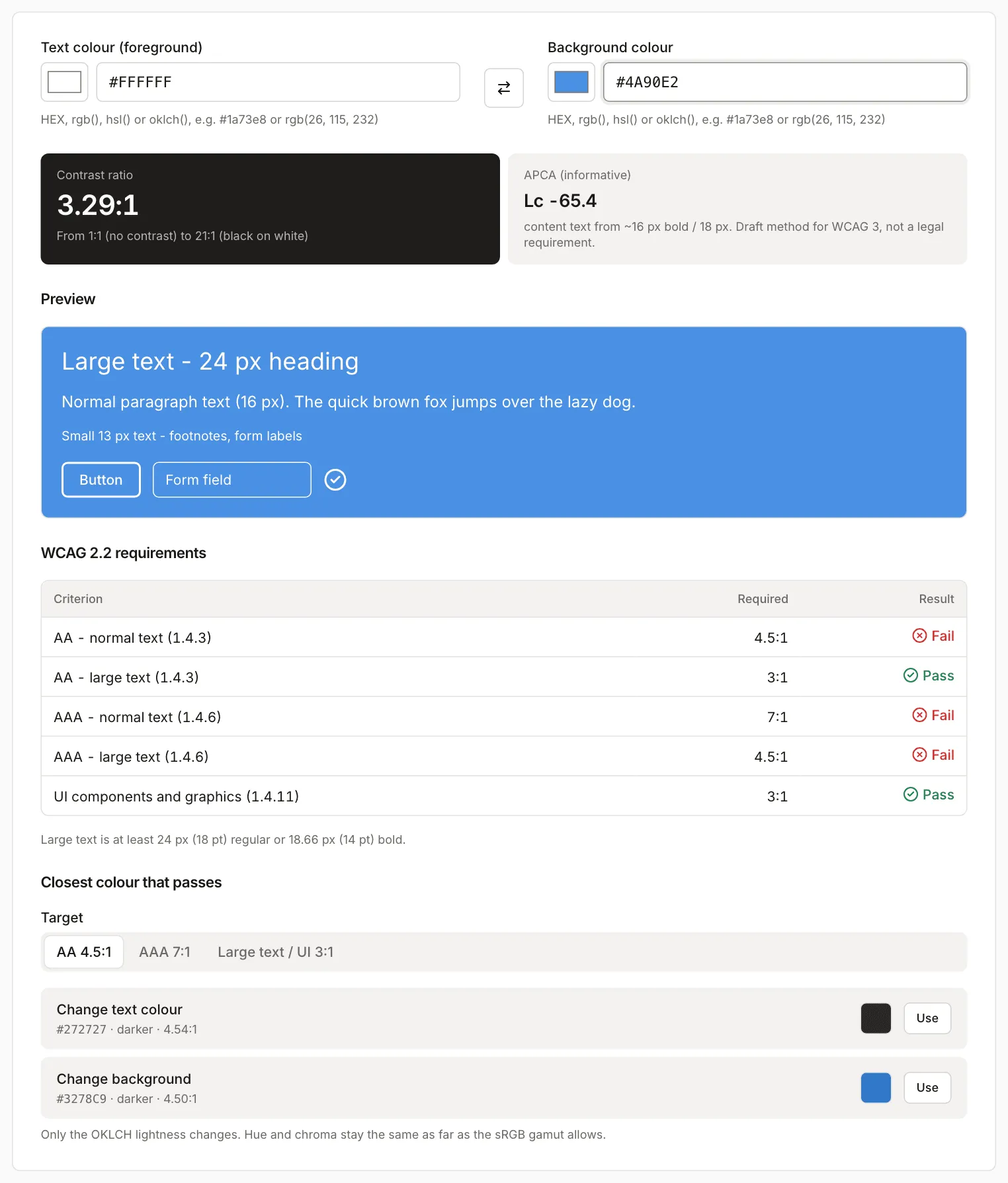
For white text on #4A90E2 the tool offers two routes. The background #3278C9 gives 4.50:1. Changing the text to #272727 gives 4.54:1, but then the button no longer has a white label. Change the element that matters less to the brand. If #4A90E2 is your brand color and the label has to stay white, the remaining option is large text: from 24 px (or 18.5 px bold) 3:1 is enough, and this pair has 3.29:1.
The Color Converter shows what changed:
| Color | HEX | HSL | OKLCH |
|---|---|---|---|
| before | #4A90E2 |
hsl(212, 72%, 59%) | oklch(64.6% 0.142 253.9) |
| after | #3278C9 |
hsl(212, 60%, 49%) | oklch(56.9% 0.143 254.3) |
In OKLCH the hue and chroma barely moved, and lightness dropped from 64.6% to 56.9%. In HSL the saturation changed too (72% to 60%), because that space describes lightness differently, so do not compare colors by their HSL numbers alone. The darker shades in the converter are made by mixing with black in sRGB. They make a quick palette to browse, but check every shade you pick in the Contrast Checker.
For AAA (7:1) a gray on white has to be darker still: #595959 gives 7.00:1.
Text over a photo or gradient
The tool compares two colors, and a photo or gradient contains thousands. W3C says contrast is measured against the background the text is actually rendered on, so test the worst spot: for light text, the lightest part of the background under the words; for dark text, the darkest.
For the example we used a synthetic 800×300 px banner with a horizontal gradient from #1F4E8C to #9CC3F5, with no photo and no noise. We picked colors at three places and checked white text against each:
| Place on the banner | Background | White text |
|---|---|---|
| 10% of the width | #2C5A97 |
6.96:1 |
| 55% of the width | #648EC6 |
3.37:1 |
| 90% of the width | #90B7EB |
2.07:1 |
| rightmost pixel | #9CC3F5 |
1.82:1 |
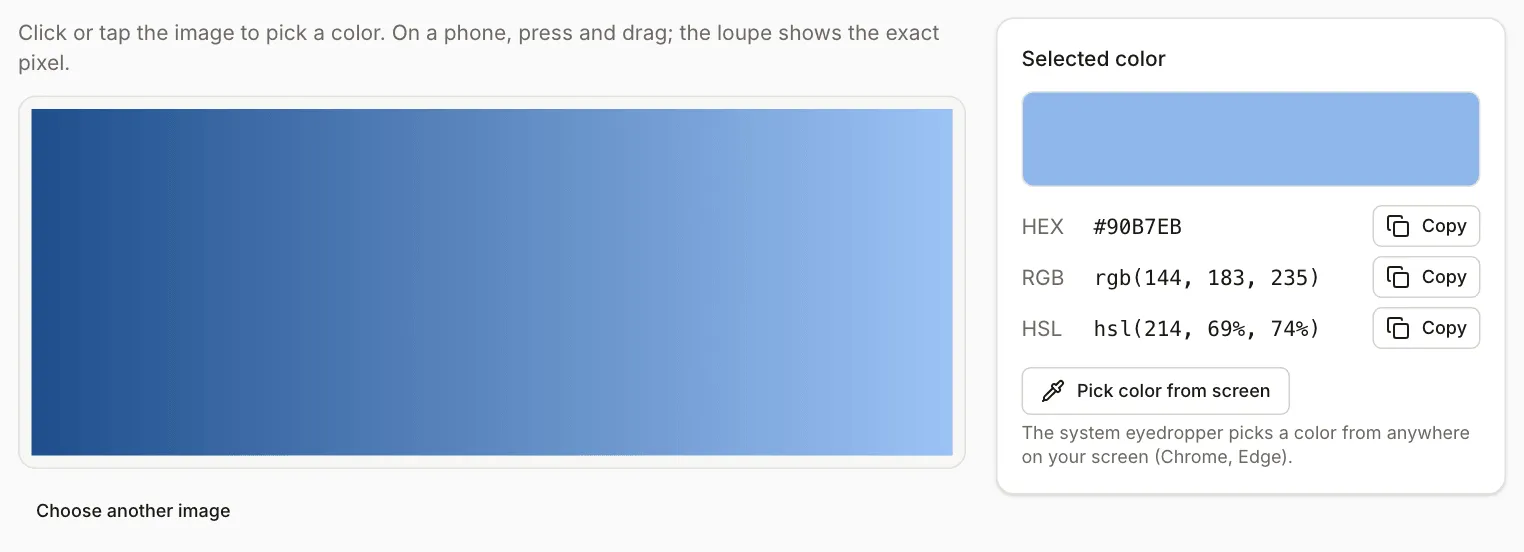
The same label is easy to read on the left and fails even the large-text threshold on the right. The “Dominant colors” palette in the picker is not enough for this check: it shows averages of pixel groups, so with the default six colors its lightest swatch (#94BCEE) is darker than the rightmost pixel (#9CC3F5).
The simplest fix is a semi-transparent black overlay under the text. Black at a given opacity darkens every channel by the same percentage, so you can work out the resulting color in advance. For #90B7EB it came out like this:
| Overlay | Color after overlay | White text |
|---|---|---|
| 20% | #7392BC |
3.20:1 |
| 30% | #6580A5 |
4.05:1 |
| 40% | #566E8D |
5.24:1 |
| 50% | #485C76 |
6.84:1 |
At 30% white text passes the large-text threshold (3:1) but not the normal one, and 40% is the first step that reaches AA. We entered the calculated colors into the tool and they match the table. The result is for the lightest point, so the darker parts of the banner have even higher contrast. On a real photo a single pixel can land on a bright highlight, so click several spots under the text.
UI components
Criterion 1.4.11 requires 3:1 against adjacent colors for the parts of the interface needed to identify a component and its state: a field border, an icon, a focus indicator. It also covers parts of charts without which the data cannot be understood. Text inside an image, on the other hand, has to meet 1.4.3, not 3:1. Check states too: hover, focus and selected states have their own colors, and in the tool you enter them separately.
APCA: a model in development, not a requirement
APCA is a different contrast algorithm. It depends on polarity (dark text on light and the reverse) and on the size and weight of the letters. Its authors describe it as a candidate method for WCAG 3 (APCA in a Nutshell, apca-w3, checked in October 2026). WCAG 3 itself is a W3C Working Draft dated 10 September 2026, and the draft says the contrast algorithm is still to be determined (WCAG 3.0).
APCA gives an Lc value, and the recommended minimums depend on the use. According to its documentation, Lc 90 is preferred for fluent text, Lc 75 is the minimum for body text columns, Lc 60 for content text, Lc 45 for headlines, and Lc 30 and Lc 15 for secondary elements. The tool shows Lc for information only. The two methods rate our pairs differently. #777777 on white fails AA (4.48:1), while in APCA it scores Lc 71.1, which is above the minimum for content text but below the one for text columns. White on #3278C9 has 4.50:1 and Lc -76.4 (the minus sign means light text on a dark background). Judge WCAG 2.x conformance by the WCAG 2.x thresholds and treat APCA as an extra hint.
Legal requirements in Poland
If your site serves users in Poland, these are the official sources (pages in Polish, checked in October 2026). The gov.pl digital accessibility service states that digital accessibility is a legal obligation for public bodies. Its page on requirements for public bodies says the act’s requirements correspond to WCAG at level AA, with minor limitations. For e-commerce services gov.pl lists the EN 301 549 standard in version V3.2.1 from 2021 and mentions an update to it. None of these pages gives contrast thresholds, so take the numbers from WCAG. This is not legal advice: whether and which obligations apply to your organization is a question for the legislation or a lawyer.
When a color check is not enough
The Contrast Checker compares two colors, so it cannot judge a gradient, a photo or text under a semi-transparent layer until you pick specific colors yourself. It does not check the weight of the typeface or the size of the text on your page, so deciding whether text counts as “large” is up to you. Passing 1.4.3 and 1.4.11 is also only part of WCAG: a page with good contrast can still have other barriers. After changing colors, look at the page in its real layout, in both light and dark themes.